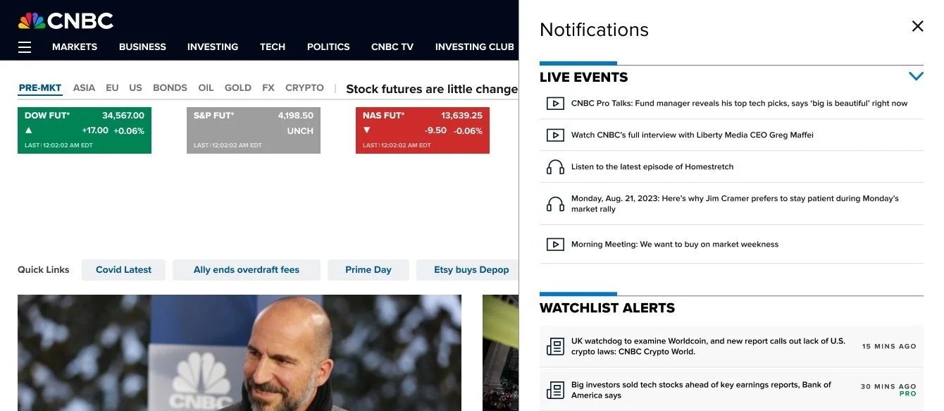
Notifications and Alerts
Problem Statement: Existing CNBC alerts are often too generic or force users to check manually, which causes information overload and means they miss key opportunities. As a result, users stay disengaged, uninformed, or make poor decisions because they lack timely, personalized data.
Final Product
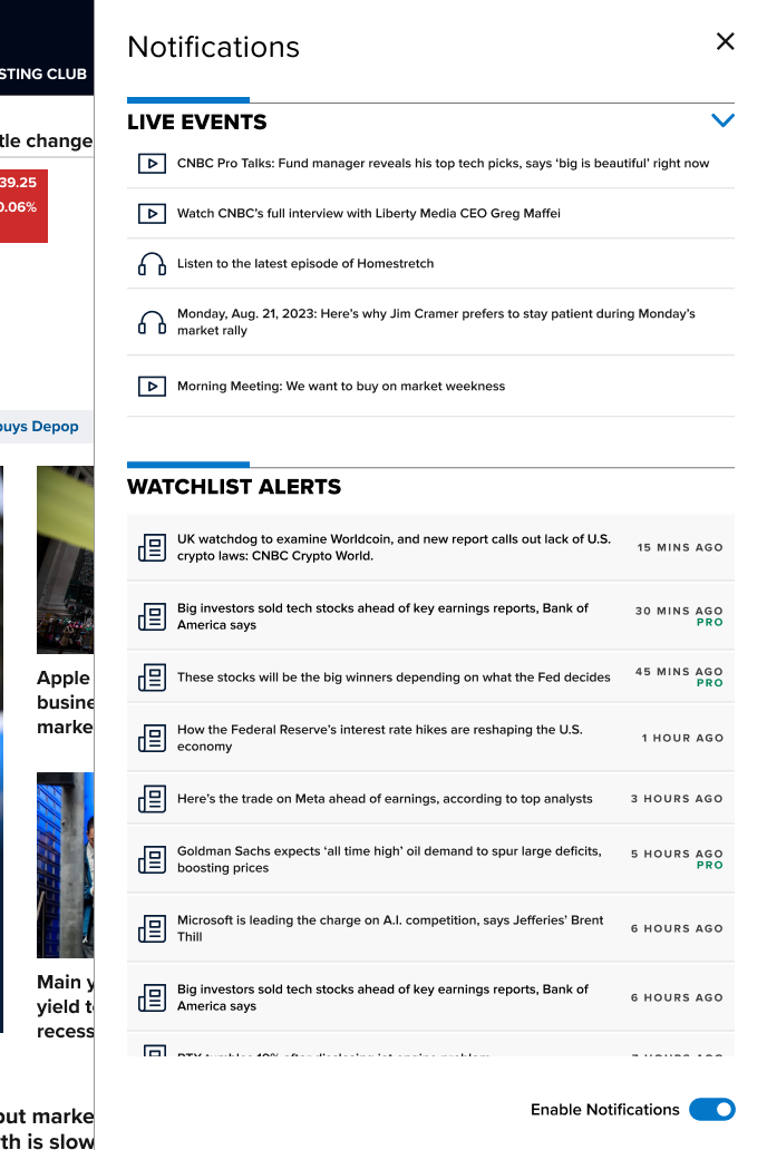
What a user with CNBC All Access may see in their notifications drawer.
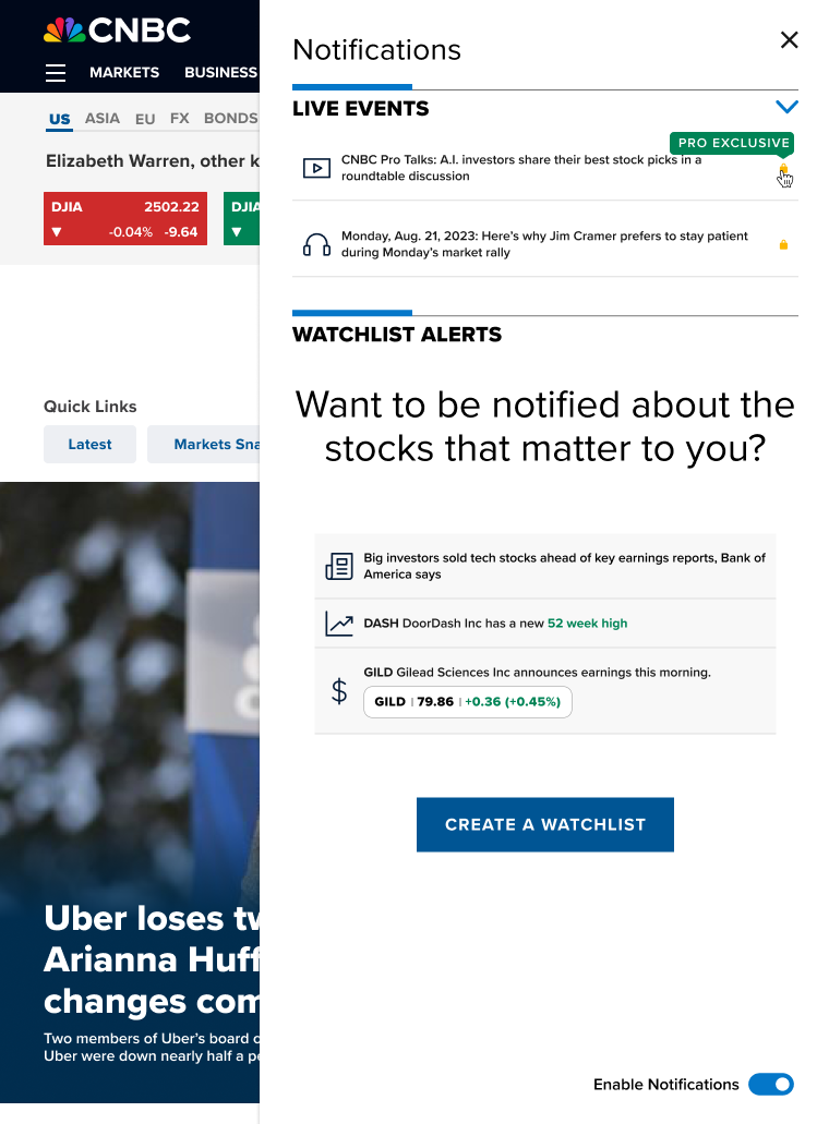
Without a watchlist set up a user will be prompted to create one.
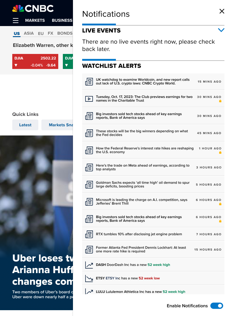
Without a subscription users will see lock icons on subscriber only content.
The Process

In-Person Brainstorming

The initial direction for personalized notifications was crucially defined by an in-person brainstorming session. Members of product, design, and engineering were brought together, with the dynamic energy of face-to-face interaction being leveraged. Concepts were rapidly generated and refined using rapid-fire ideation and mind mapping directly on whiteboards. This immediate, collaborative environment fostered significant breakthroughs that had not emerged from remote discussions. A clear, shared vision for the project was ultimately reached, thereby laying a strong foundation for development.
Competitive Analysis
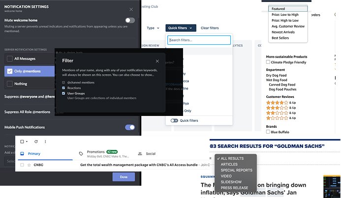
A foundational step in the project was competitive analysis, which was used to understand how different platforms handle information overload. By examining various information-dense products, established patterns and best practices were identified for prioritizing what is important to users. A high-level comparison helped deconstruct their core strategies, providing a clear framework for the design of an effective and intuitive prioritization system. The insights directly informed a signature offering for our specific user base.
“It has less general notifications, they’re all very personalized…it’s very useful…you don’t have to look at everything individually especially if you have many watchlists…you can also look at them while reading articles on the website or watching videos.”
Initial Designs and User Testing

Initial designs for personalized notifications based on a users’ watchlist were user tested using low-fidelity designs to assess comprehension and usefulness. The goal was to determine if users understood the intended hierarchy of the notifications and found the content valuable enough to engage with. This testing confirmed that the icons as visual cues were effective, as users could easily differentiate between various types of alerts. However, a critical need to address timing and frequency was also revealed, as even relevant stock notifications that were too frequent could be an annoyance. This feedback was essential for moving beyond visual design to a more holistic strategy for delivering news.
Phase One Release

The main objective for the launch of phase one was to quickly implement a live-event notification system to give the users a news alerts experience while building out the watchlist notifications.
The focus on quickly launching a live-events notification system without the personalized watchlist alerts served two primary functions:
It allowed for the fastest possible deployment to confirm the functionality of the alert system.
It clearly demonstrated to paying members exactly which high-value, real-time events were included as an immediate benefit of their membership ie CNBC Pro Talks or Jim Cramer’s Morning Meeting.
Phase 2 Usibility Decisions

To make alerts easier to scan, custom icons were designed to allow users to quickly grasp the type of notification. In the world of financial news, the ability to process information rapidly and ensure its relevance is crucial.
Lock icons were placed on articles that require a specific subscription to view. This simple visual cue helps users immediately know they cannot access the content, reducing the annoyance of clicking an article only to reach a dead end. When a user hovers on the lock icon, a tooltip specifies to the user what product they must subscribe to.
Data from phase one revealed that live event alerts alone were not performing effectively, leading to the additional feature of allowing users to collapse those alerts.
To provide a better user experience, the capability to disable or enable notifications was introduced, granting users greater control over their alert preferences.
A side drawer was chosen for the notification area instead of a dropdown or a modal. This was done to future-proof the design because the drawer's size stays the same no matter if the user has a few alerts or many. Also, the side drawer was chosen because it's already a standard component used across the entire CNBC platform.
Design Challenges

A final, critical step involved making sure the alerts delivered the right information to the right subscriber group. Users in the Investing Club, for instance, valued different news updates than those holding a CNBC Pro subscription.
The design team had to carefully balance three competing priorities:
The Marketing team's need to promote subscription upgrades.
The Product team's drive to launch the initial system quickly.
The need to deliver an optimal user experience.
The design process was complex because it had to manage the personalized nature of user watchlists alongside the different products user priorities, requiring many moving parts to work together seamlessly.
Final Product

What a user with CNBC All Access may see in their notifications drawer.

Without a watchlist set up a user will be prompted to create one.

Without a subscription users will see lock icons on subscriber only content.